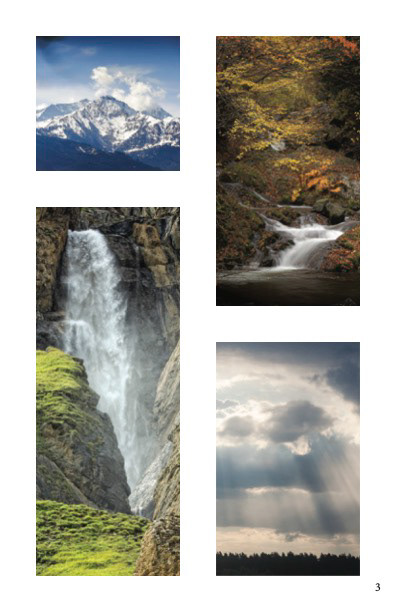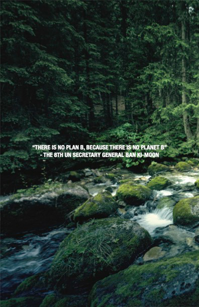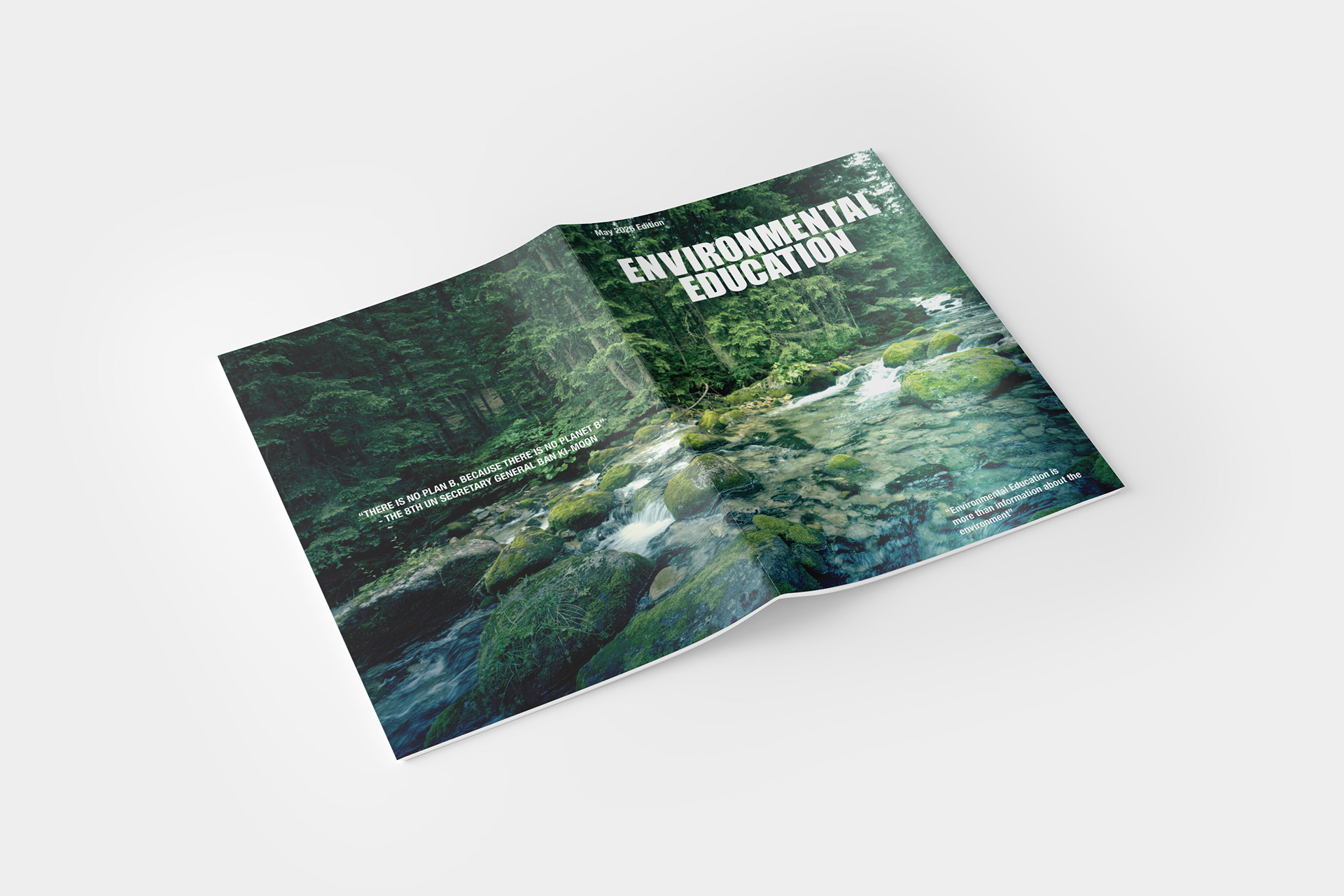
This project features a magazine layout focused on environmental education, designed to practice balancing heavy imagery with clean typography. To create an immediate connection to nature, full-bleed landscape photos are used as backdrops for bold, modern headings. A strong grid system keeps the Table of Contents and internal spreads organized and highly readable. Overall, the layout serves as a practical exercise in establishing a strong visual hierarchy and making data-heavy editorial content look clean and engaging without feeling cluttered.