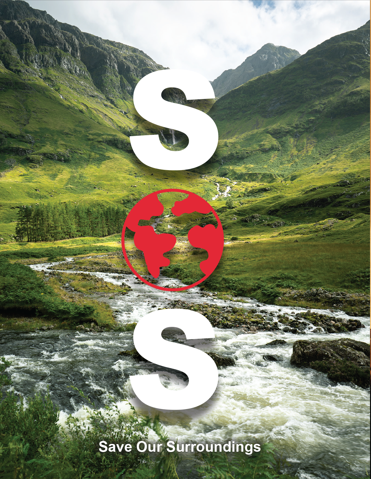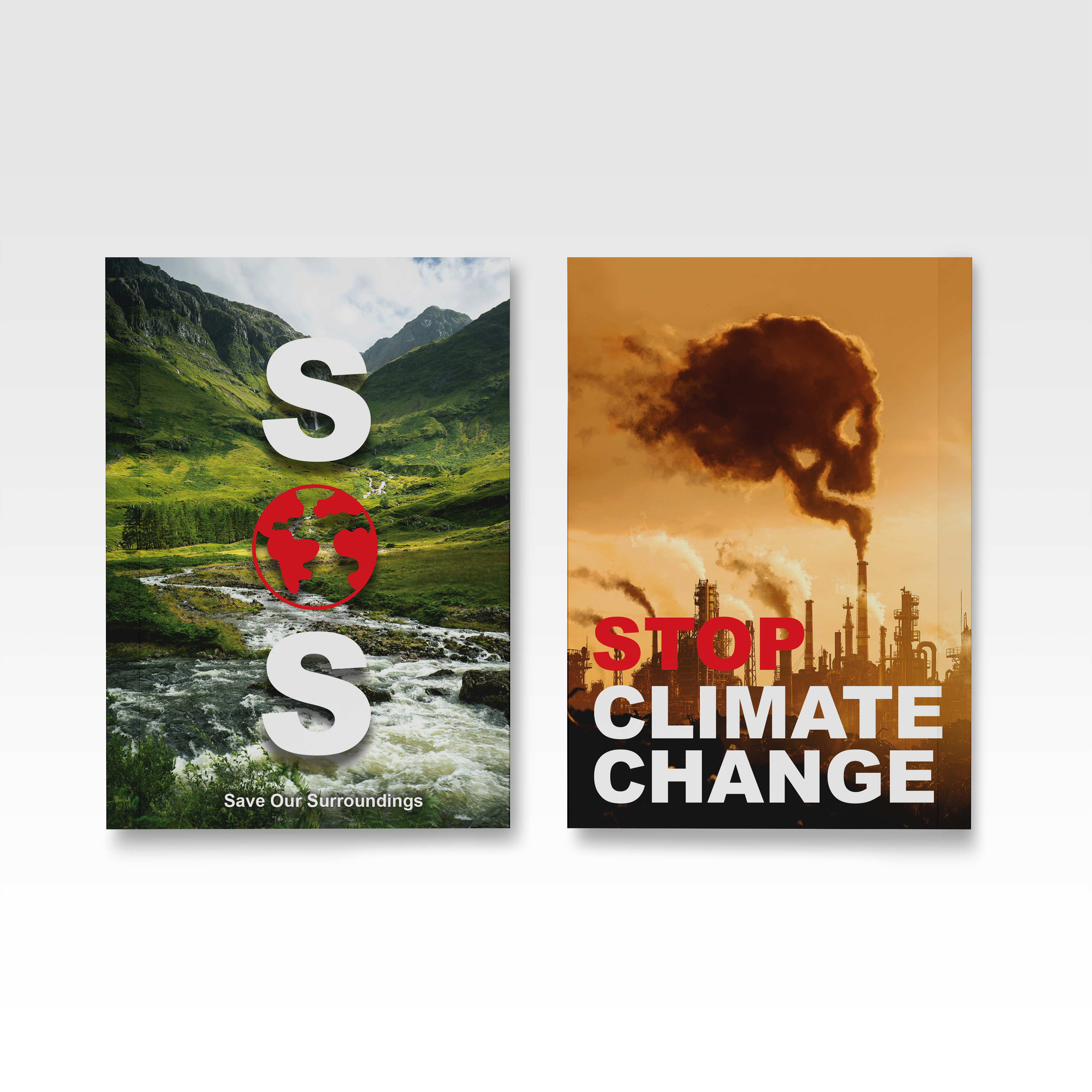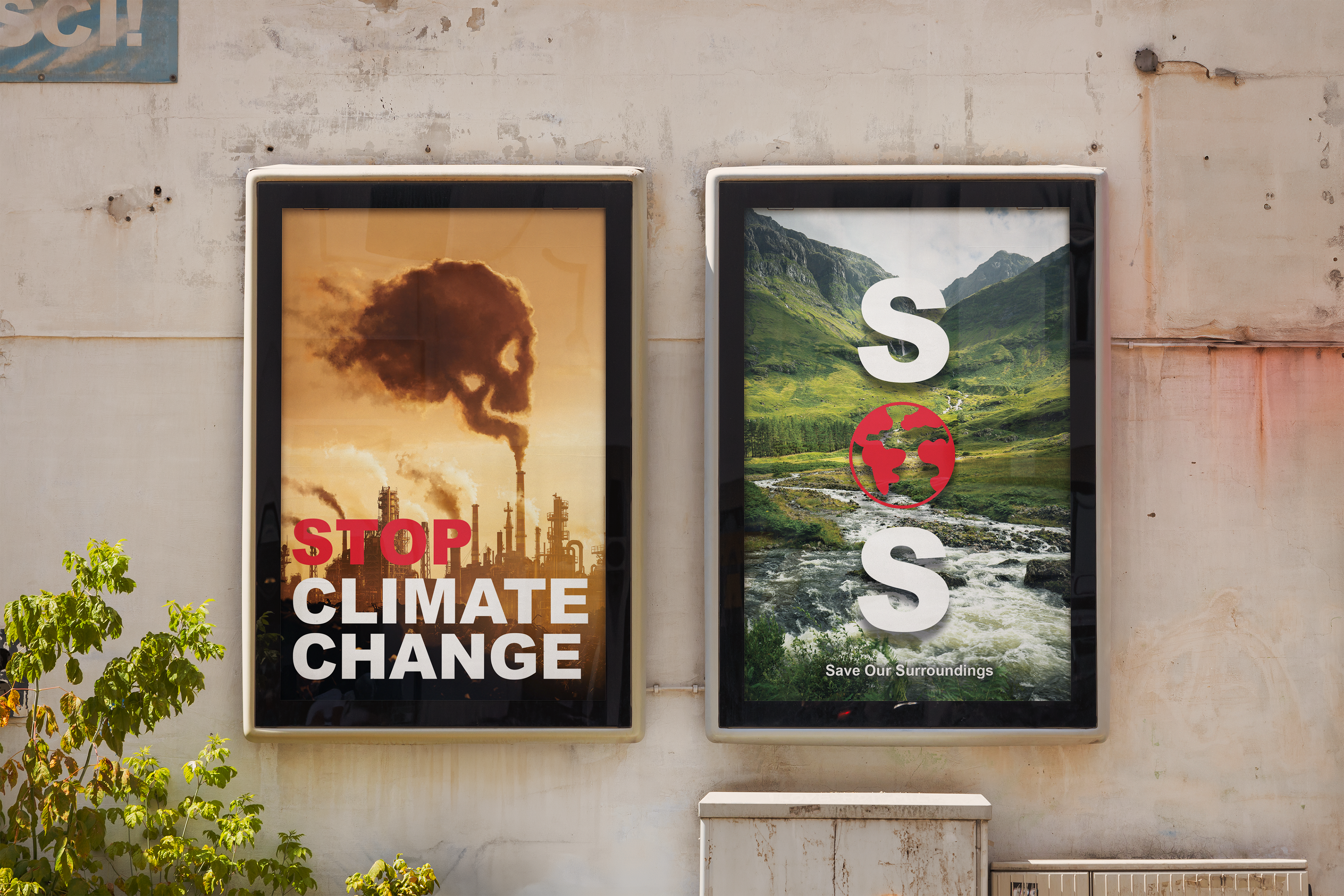
To command immediate attention, I used large-scale, heavy-weight sans-serif typography to spell out ‘SOS’ (Save Our Surroundings). The second ‘O’ is cleverily replaced by a custom-designed Global Distress Icon: a red, stylized map of the world encircled by an abstract red flame/globe graphic. This icon, with its intense red hue, creates a powerful visual anchor. A small tagline, ‘Save Our Surroundings,’ is placed at the bottom to provide context and define the acronym. The clean layout and dominant typography make this design highly readable from a distance.
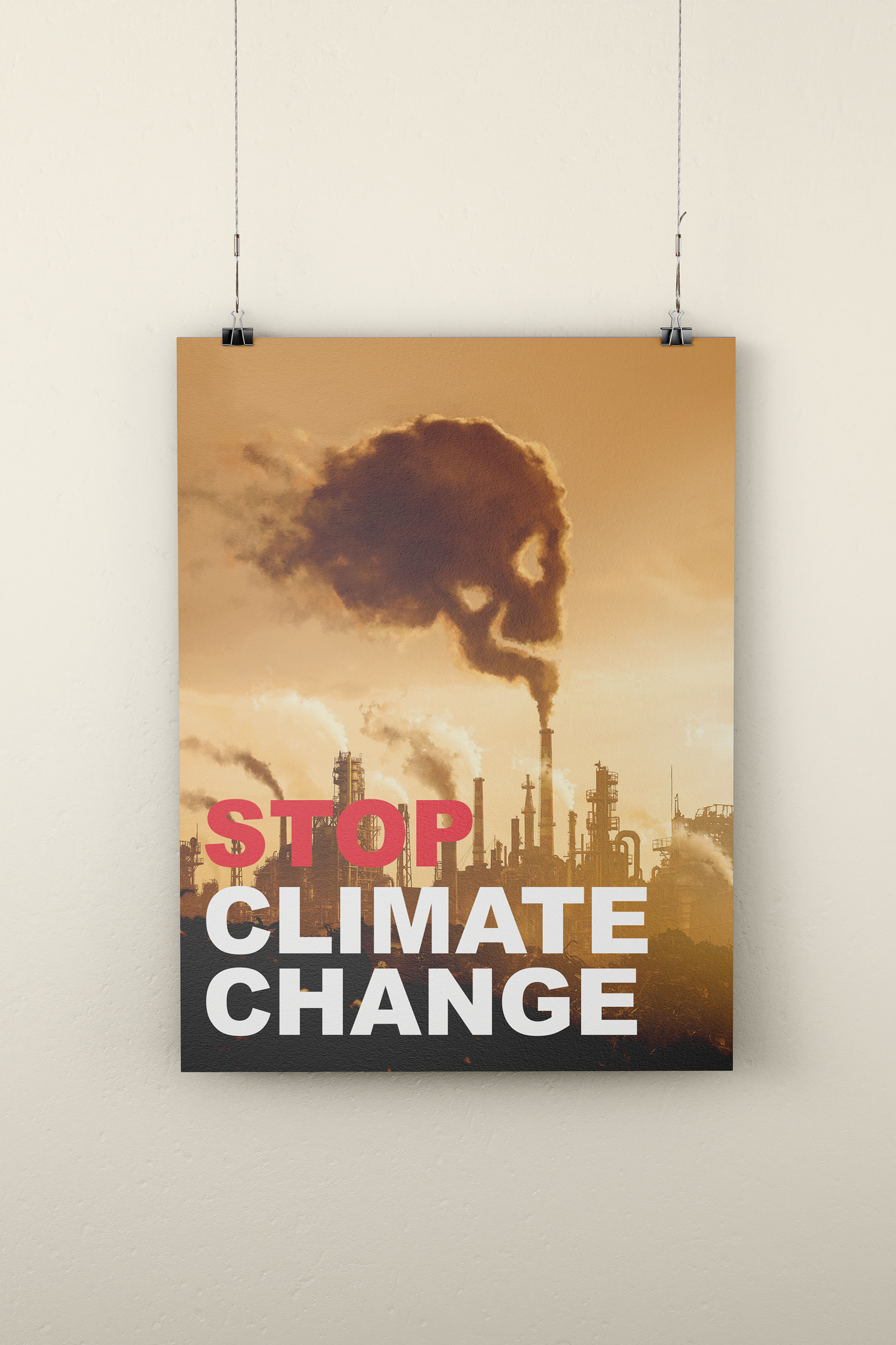
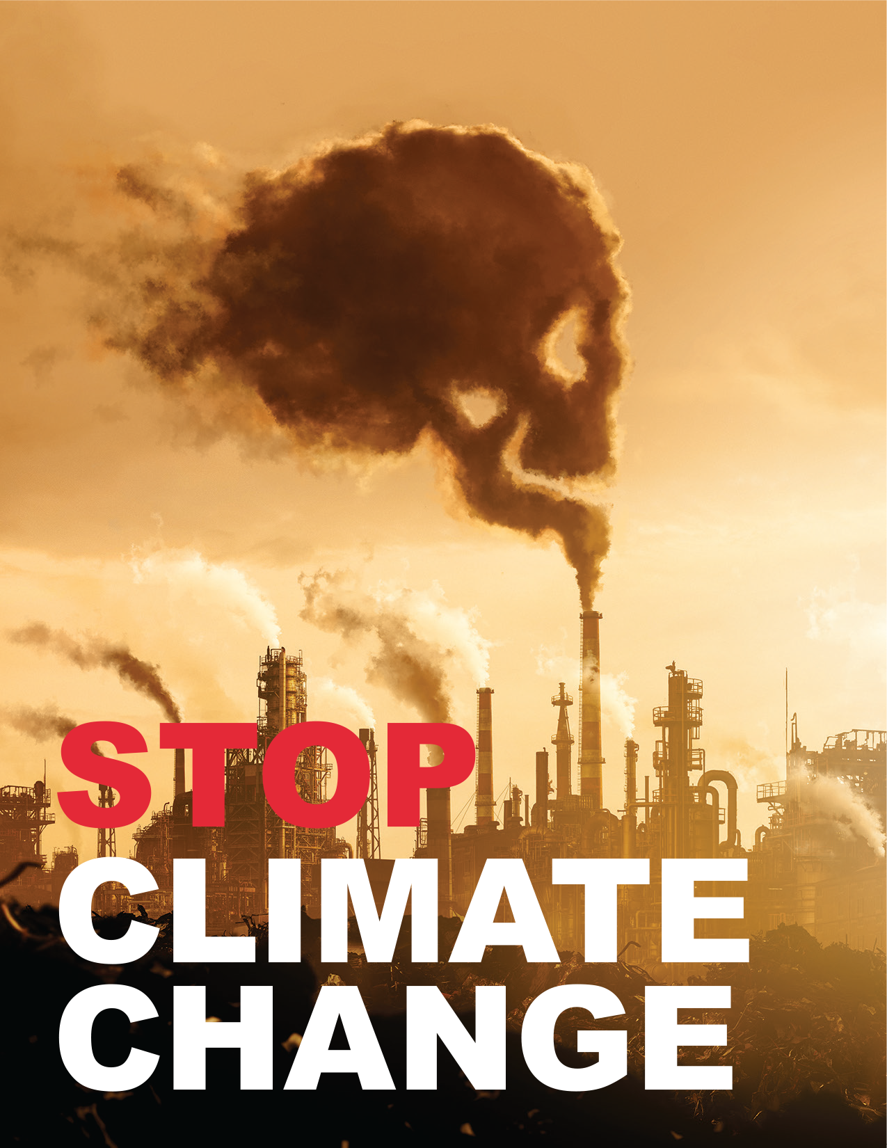
I used aggressive typography. The word ‘STOP’ is rendered in a bright, warning-sign red, followed by ‘CLIMATE CHANGE’ in white, all in an all-caps sans-serif typeface. The contrast between the red and white text adds urgency and emphasis. This design, in its color palette and symbolism, is visually disruptive and designed to stop viewers in their tracks.