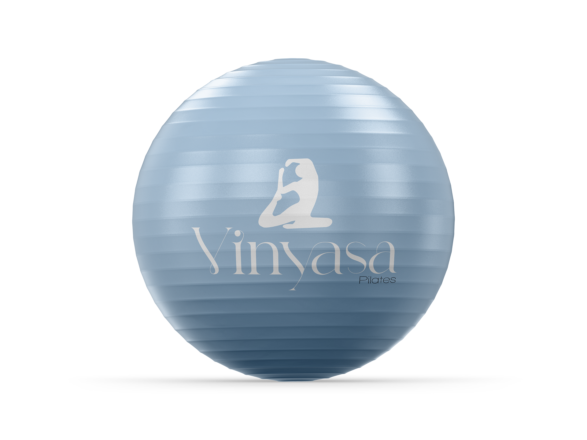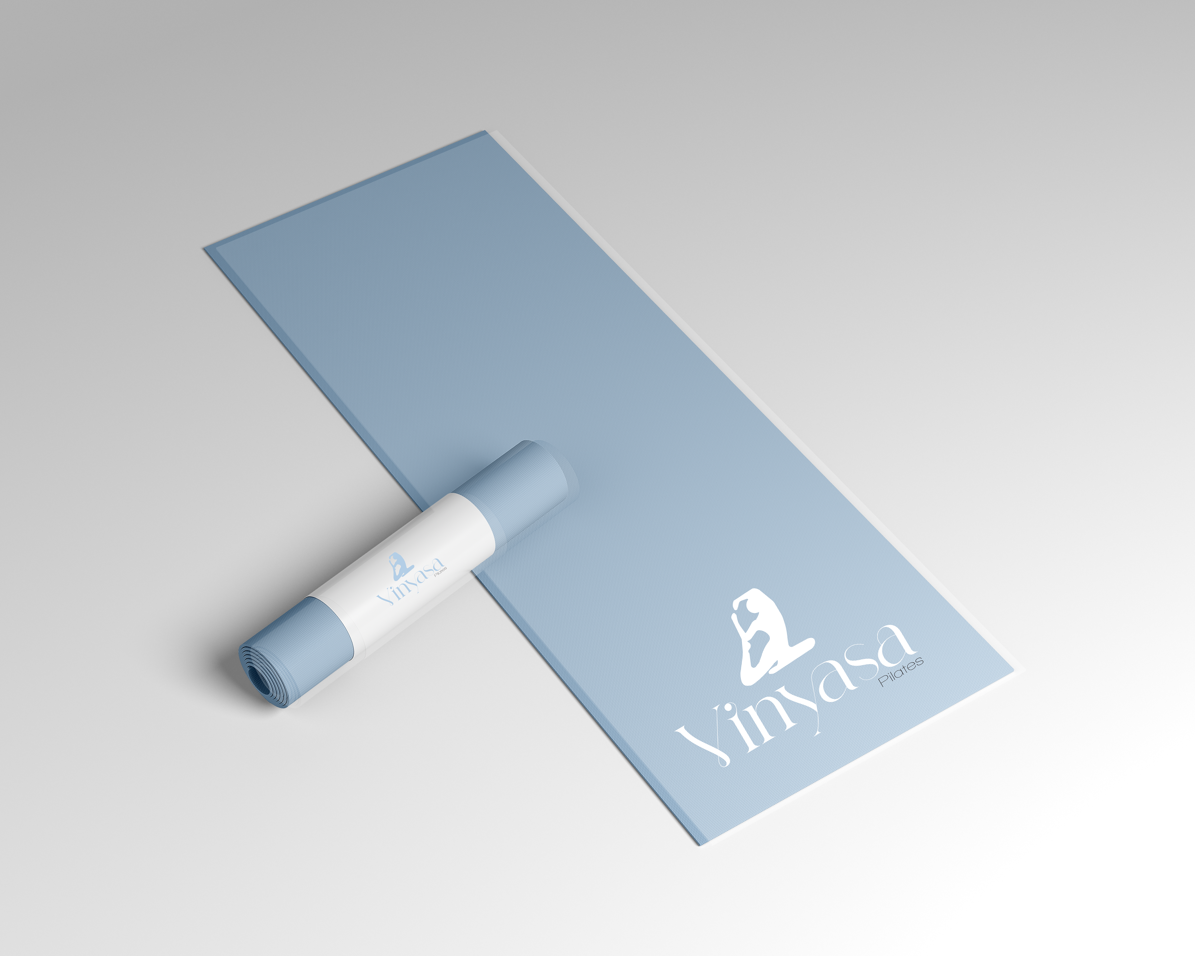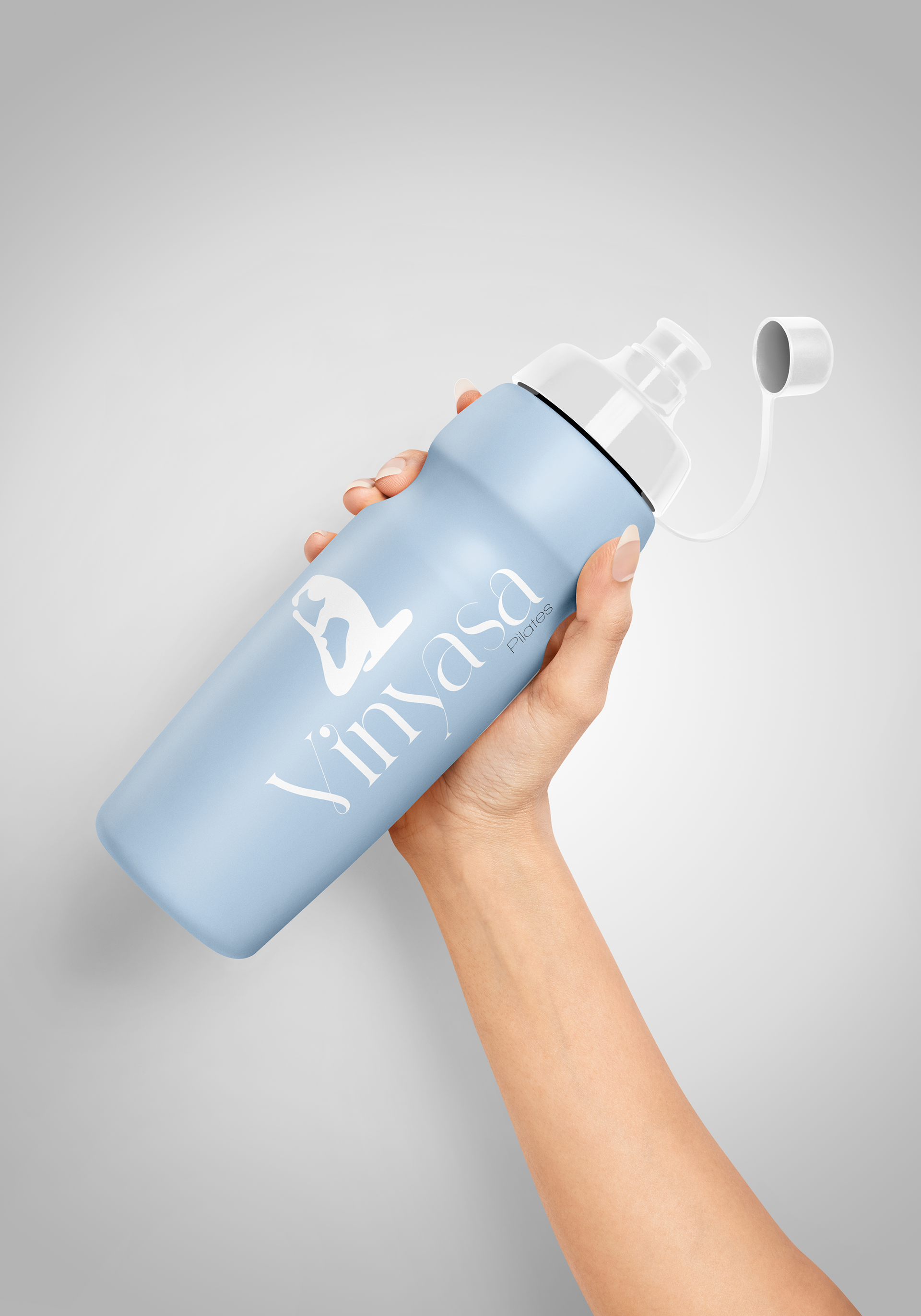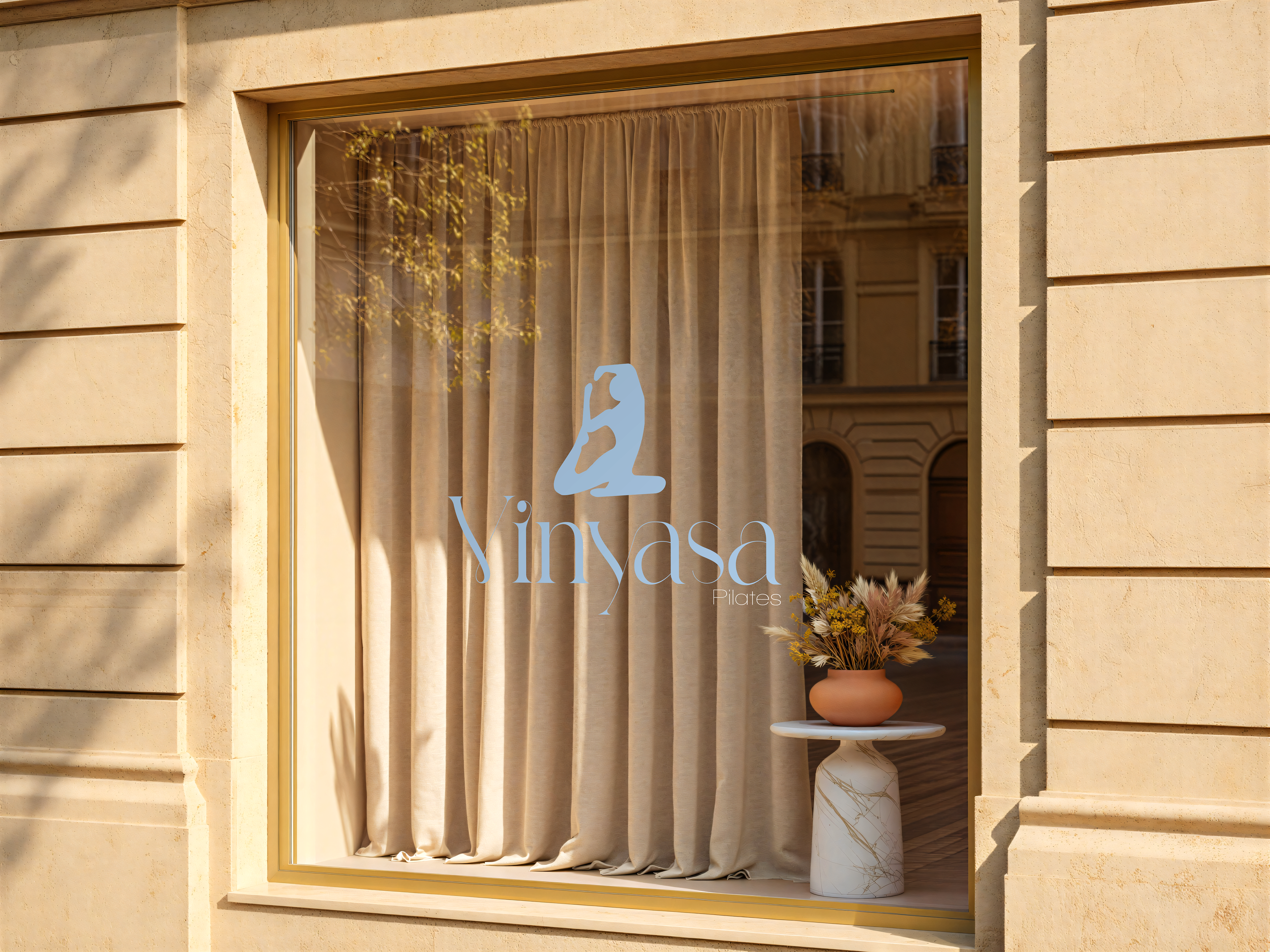
This project features a logo design for a Pilates studio, focusing on the intersection of fluid movement and elegant typography. To reflect the balance and flexibility central to the practice, custom modifications were made to the letterforms—specifically the stylized, sweeping swashes on the “V” and “y”—to mimic organic human motion. The icon above the wordmark reinforces this concept by using a clean, abstract silhouette of a pose that flows naturally into the text. Paired with a soft, calming pastel blue and a clean sans-serif secondary typeface for “Pilates,” the layout serves as a practical exercise in creating a cohesive, high-end wellness brand identity.